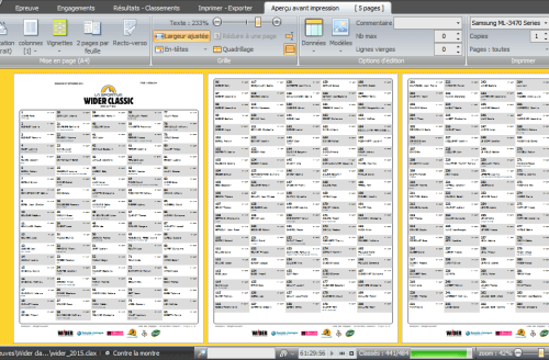
Thumbnail printout mode
Introduced not long ago, you've probably seen this new feature in the print preview:

Still under "experiment" to see if runners take it easy - or not - when looking at their results on the paperboard and thus if some further tuning may be interesting, this new way of printing was born with multiple purposes in mind:
- Modernize the old boring table display - and give you another distinctive mark that everyone can see.
- Get more runners on a single page, especially when the number of information pieces is not wide. Makes it possible to have some 100 items on the first page with the default header. And the result is more visually appealing than the multi-column mode. You can save paper in situations when for example you have to distribute a participant list with a few basic information.
- Introduce opportunities for design variations - align, font-size and weight, multi-line data,...
Result

Hoping you'll enjoy it! and why not make it your default printing way for the future.
On the roadmap
The feature is already available with a panel of pre-defined thumbnail templates. Choosing the number of columns and the flow direction (top to bottom or left to right) is also OK.
Next step will be finding out a possible design for triathlons, including the segment rankings. And open a thumbnail designer so that you can customize your own templates. Will be interesting to make it work with custom data of your own.
Gives you more ideas for new displays? Don't hesitate to share them.